

In pictures: A short history of the Liverpool FC crest
Liverpool FC have today launched two newly-designed crests commemorating the club's 125th anniversary.
As has often been the case throughout the Reds' 125 years in existence, the emblem emblazoned on the shirt next season will differ from the 'main' crest that is set to be found elsewhere.
But how have both evolved throughout the history of LFC? Read on below to find out...
1892-1953
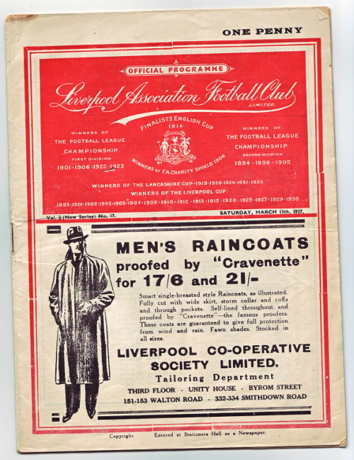
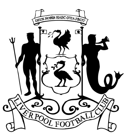
The club initially took up the city of Liverpool's coat of arms as its emblem. The design features the Roman god of freshwater and the sea, Neptune, and the Greek god and messenger of the sea, Triton. They flank two Liver birds, or cormorants, while the Latin phrase above reads "God hath granted us this ease". The crest can be seen below printed on a matchday programme from 1937, and in greater detail below that.
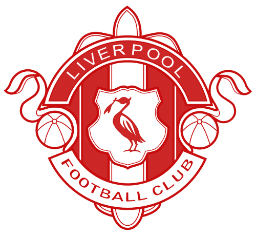
By the late 1940s, the club also had an alternative crest that was used on merchandise, matchday programmes, letterheads and more. It might be familiar to supporters of a certain club from down the East Lancs Road, who went on to adopt a similar design in the 1960s. The last known use by Liverpool was in the early 1980s.
1950-55
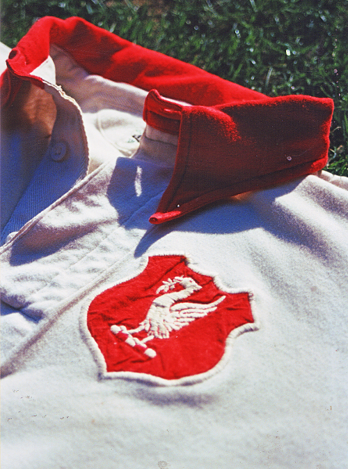
By the 1950s, the club had moved to a more stripped-down design featuring a single Liver bird. This was the first logo to make its way onto a kit, being emblazoned on the white jersey worn for the 1950 FA Cup final defeat to Arsenal.
1955-68
A redesign in 1955 added 'LFC' to the crest, which featured on home shirts for the first time - as it has ever since.
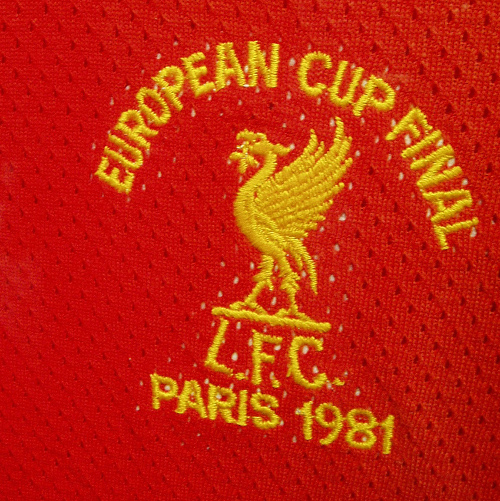
1968-87
After a Bill Shankly-inspired move to an all-red kit in 1965, Liverpool opted to change the crest once more in 1968. This version did away with the oval that had previously surrounded the Liver bird. Between 1976 and 1985, the logo was stitched in yellow rather than white, as shown in the below picture of a special version created for the 1981 European Cup final.
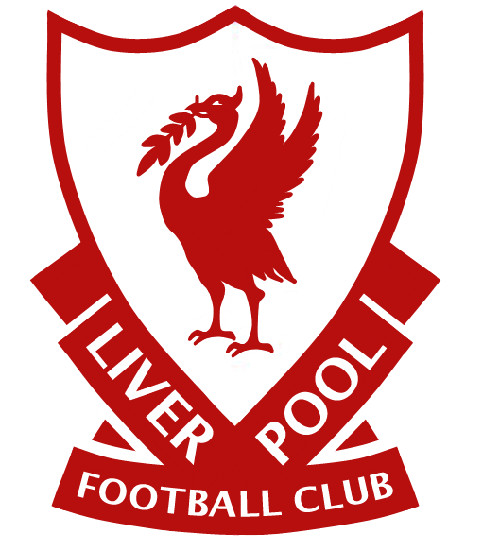
1987-92
A move toward the shield shape that has since been a fixture of the club's logo, this new design also incorporated the words 'Liverpool Football Club' on the shirt for the first time. This version had existed prior to its inclusion on the kit for the 1987-88 season.
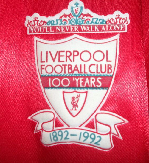
1992-93
To mark the club's 100th year, this special crest was commissioned and used throughout the 1992-93 season. The Shankly Gates, including the lyrics of the club's anthem 'You'll Never Walk Alone', were another significant addition. Below is a version seen printed on shirts for that campaign.
1993-99
Following the club's centenary year, a slightly amended badge was placed on shirts in subsequent seasons with two eternal flames added in memory of the victims of the Hillsborough disaster.
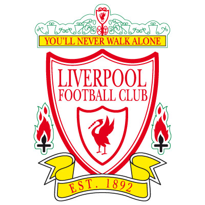
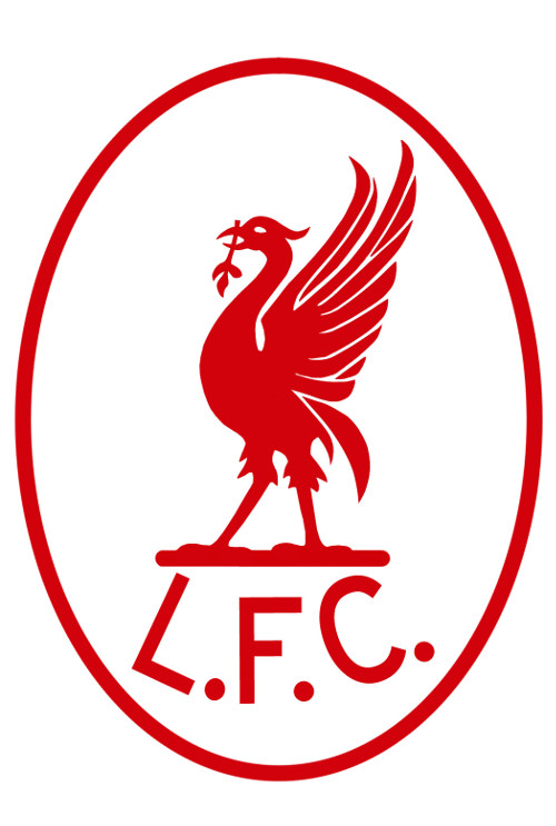
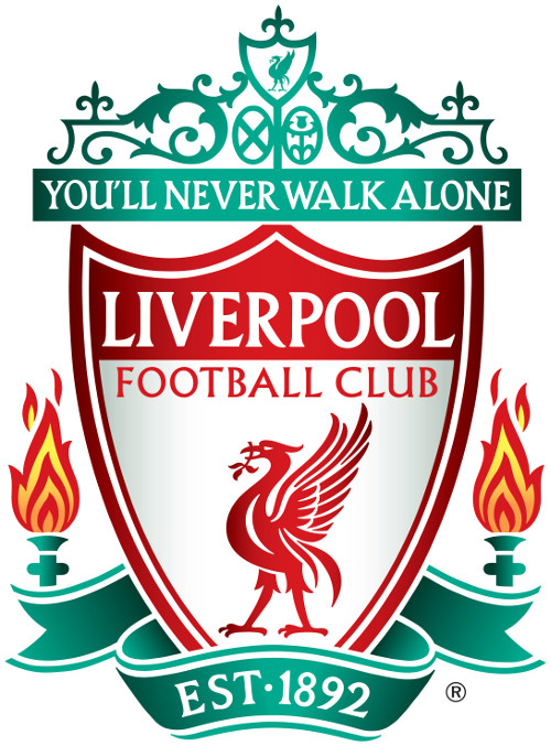
1999-2012
In 1999, the crest that is still used by the club in an official capacity was created. Although it hasn't featured on kits in recent years, this version of the logo is found on all official merchandise - not to mention the front of the Main Stand at Anfield.
2012-17
Recent seasons have seen the return of a more minimalist logo design, reminiscent of that worn during the richest period of the club's history. As was the case in the past, the colour has varied between white and yellow on the red shirt in different seasons.
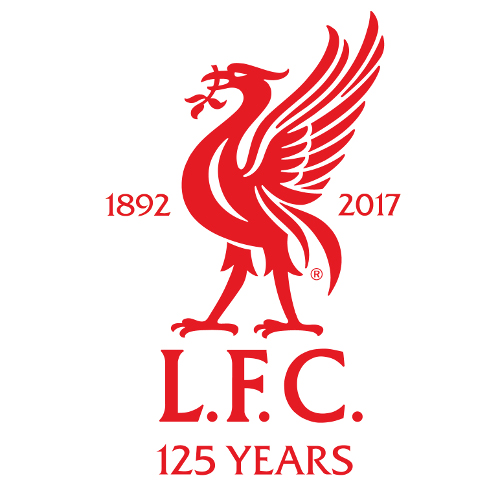
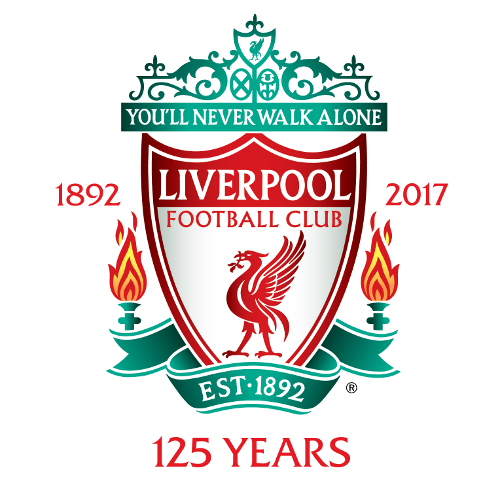
2017-18
The new special edition of the Liver bird crest, which adorns the New Balance home jersey for the 2017-18 season, marks 125 years of LFC. The club crest has also been tweaked to commemorate this significant milestone, and both will be used between now and the end of next season.
Click here to buy the New Balance home shirt for 2017-18 featuring our new 125 commemorative crest.